Monday, 16 November 2009
1. In what ways does your media product use, develop or challenge forms and conventions of real media products? (i.e. of film openings)
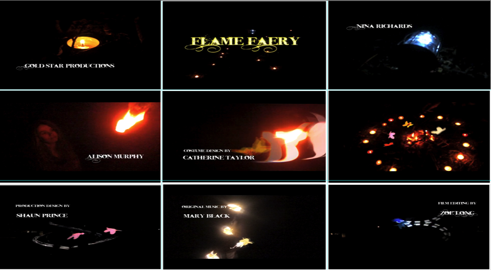
(from left to right)
Frame one shows:
The setting of the film. This candle and the shot which follows it shows the scene of the woodland area which is very dark. A lot of film openings use the technique of showing a close up of a small element in the location and then gives away the whole scene. We decided to use this as it ties in well with the next shot with the pathway with the candles. It also adds to the mystical atmosphere which this film opening revolves around.
Frame Two shows:
The title of the film. Originally in our rough cut the main title had the same font exactly as all of the other titles. This meant that it didn't stand out and also, after looking at some title sequences on the art of the title website, we realised that most title sequences have the title quite earlier on in the sequence. We made the title earlier and I imported the text into Photoshop (as we wanted to use the same font to keep the theme, but also wanted it to change and stand out from the rest). In Photoshop, I simply put the text onto an alpha background and adjusted the blending options such as glow effects and shadows. I also put a light yellow overlay filter onto the text as it looks nice glowing against a black background. Then I exported it as a png. Sophie worked on the rest of the titles and tweaking them so they are safe to show on television as well as looking nice. We chose to use the spelling 'faery' rather than the more well known 'fairy' as it is more a folklore spelling of the word. We realised that some films are based on tradition and this is an aspect of ours.I think it's true to say that this is slightly a creative risk as the audience may be confused as to why it's spelled that way. However, as you can still understand the meaning, I think that it just makes our opening more unique.
Frame 3 shows:
The props we used. As mentioned in the preperation posts, we had originally got many props for our scene. Sadly not all can be seen in the final video or the rough cut as we cut out the dialogue scene. We had tents and a bonfire etc. What we kept however is this lantern. This is a significant prop for the scene, and it's the first thing the audience follows as they can't see the girl very well. The way the girl dramatically drops the lantern and the camera work as it falls I think works well for the plot. As the girl is reacting to what she can see.
Frame 4 shows:
How characters are introduced.
Frame 5 shows:
Special effects
Frame 6 shows:
Camerawork and editing.
Frames 7-9 show:
The genre of the film (fantasy and supernatural), and also parts of the story and so what to expect from the film, hence why they are towards the end of the opening, as they could be leading into any scene which would still be in some way connected to the faeries.
Evaluation: Task Two
I think that our main character is similar to Ofelia in 'Pan's Labyrinth'.
This is because both are the young protagonist in a supernatural film, and are both chasing the mystery and get caught up in it. Though Ofelia is younger, both characters seem to have the same look of awe in the two frames above. The lighting of the frame shines on the character from the right side of the frame as well, where the characters are looking. I think that this works well as a symbolism for a happy ending/ future for the character, though mainly the scenes are in darkness. Mine and Sophie's film represents this character as the main focus as she is the only person in the opening scene. The camera follows her movements and then shows from her view what she sees. This can help the audience to feel the atmosphere and can relate to the character in the film well.
3. What kind of media institution might distribute your media product and why?
Voiceover script
''The first ident, Gold Star productions, is supposed to represent our well known company as one of the best. The name of the company 'Gold star' shows how it is above the others, without literally saying so. The way it's animated to appear on the screen is dramatic so it has a strong impact. It also has formal writing to show it's professional style of film. ''
'' Sundance Productions is a smaller company which focuses on this type of film. It's potential was recently recognised by Gold Star and they co-operated to create this film. This was good for Sundance as extra money was needed for the CGI effects throughout the film.''
We were partly funded by the British film production company 'Working Title'. They were interested in our film as they have already been involved with similar genres- folklore based storylines such as Robin Hood and the fantasy of Mary Norton's 'The Borrowers'.
We chose the main title to appear here because we didn't want our opening sequence to appear like a trailer, but wanted to introduce it along with something else. As it says 'flame faery' the main character is introduced properly and pretty soon afterwards we can see these fairies. The character's titles appear at the same time we see the girl, along with her co-star actor's name. The titles progressed with more of the crew before concluding with the Producer/director type of credits.
We chose this font to use throughout the sequence to contrast with the abstract video. The names of the cast are if a larger different font than the more industrial names of the jobs.
We chose to use the most important roles such as producers and the main actors. This was based around the way most films use their titles, and the generic main titles which appear in the opening sequence of a blockbuster type of film.
4. Who would be the audience for your media product?
Target Audience for Our Movie
How old are they?
17 years old
What gender are they?
Female
What are they called?
Daffodil
How do they dress?
Hippie skirts and tops, tries to be different from anyone else she sees.
Where do they live?
In a quiet village, but near to a town with a cinema and plenty of shops.
What do they spend their money on?
Clothes, films, books.. Occasionally some fancy dress outfit or some music.
Where do they watch films?
In the local cinema e.g The Arts Picture house. And DVD's at home. Will only watch particular artistic films which interests them after looking into it.
What kind of music do they like?
Classical music (from the romantic period), alternative music, female vocalists.
Do they buy music?
Yes
What do they do in their leisure time?
Write poetry, listen to music and watch films
How much TV do they watch?
They rarely ever watch TV, because they prefer films.
What is their favourite film?
Pan's Labyrinth
Do they play video games?
Very rarely
Where were they born?
In a small local hospital
Do they go to parties?
Not often, will go to poetry gatherings or fancy dress.
Three features about their best friend?
- Wears jeans and t-shirts
- Into rock music
- Watches a lot of TV and won't go outside the house
Do they have any pets- Which?
Flying Squirrel
What is their favourite colour?
Green
I think this sort of person would watch our film as she would relate well to the main character. She also needs some sort of escapism from her own life which is not very accepting of her strange personality- Her friends are into different things as she is for example and seem like strangers to her as she won't fit in.
6. What have you learnt about technologies from the process of constructing this product?
7. Looking back at your preliminary task (the continuity editing task), what do you feel you have learnt in the progression from it to full product?
I have learnt some new editing techniques since when we did the preliminary task, and also have developed some camerawork and CGI skills in the process of achieving our goal. Also we have learnt how to use the techniques which we learnt during the preliminary task in our film making. I think it's surprising how quickly the three rules we learnt that day has become like a second nature now when they seemed so tough to pull off at the beginning.
I think we mainly used the match-on-action rule in our filming. Here is a screengrab of how we used it in the preliminary task:
This shows the character simply opening the door into the room, but the camera movement should be fluid, and should not seem strange by the audience.
In our film opening, we used the match-on-action filming on this shot of Alison walking:
I think the real film opening match-on-action camera movements seem smooth, as I'd had practice using them by then and making them well seemed more important than in the practice sessions.
Saturday, 14 November 2009
Positive moment in our filming!
This is a drawing I did in my notebook about the comprimise we did as we couldn't see Alison walking away from the campfire into the woods. We got her to hold the lantern, and we each took 2 candles in order to create the pathway.
I used an effect on photoshop to make the background black, and the picture bolder and in white. This is because it was shot in the dark.
Though this was spontaneous I feel that this is the best shot we took the whole time.
Friday, 13 November 2009
Classification of our film
For our film, we would give it a classification of 12A. This is because our film will overall, have a very dark tone throughout, such as that in the film Persepolis which is also a 12A. Also there is mild violence in our film.
Wednesday, 11 November 2009
Thursday, 5 November 2009
Ident for Open Evening
We have started to prepare for Open Evening on Wednesday and Thursday Evenings next week. As a part of our display at open evening we will have all the recent projects from the creative and media students on display. Our task was to create ident videos including the word 'Cram' which will go between the main clips. They should be up to 30 seconds long and animated using istopmotion.
Me, Alison, Alex and Sophie all set up a bluescreen in the background and made lego pieces for the letters. We wanted the effect of the sea so we found a lego boat for some people to sit in as a prop. We animated the boat pushing the letters into the frame backwards as it was easier to take letters away than put them into the frame. We set the frame rate as 12 fps in istopmotion and exported into final cut. Then we took away the bluescreen using chroma key and got a video from vimeo to put into our background. We took out the sund from this clip.
Wednesday, 4 November 2009
Creative Risks
One of the creative risks which me and Sophie took with our film opening was filming in the dark. This had many 'costs' associated with it for example we hadn't really used the cameras before. To fix this problem we invited Kirk to join us from the L3 Diploma in year 13 as he has been using these cameras for over a year and has a lot of experience. Another cost would be that the camera wouldn't pick up people very well. We also thought at first we would have to film in the daytime and use final cut or some other editing program in order to give the effect it was nighttime.
Despite all of this, we still decided that filming in the dark was the best option. For one reason it's the way the film needed the darkness for atmosphere, and for another the fire troupe people need to be as invisible as possible so the faeries look like they are flying on their own. Fire troupe also do not practice in the daylight and so we wouldn't have been able to use that special effect in the same way.
Tuesday, 3 November 2009
My opie
For this task we were assigned a task to create an opie in Photoshop based on a picture of ourselves. This was based around the Juno video in case we wanted to create a similar effect.
I first got a picture of myself (I don't normally have dark hair it was a wig) shown below:
I opened this file in Photoshop and added a new layer. Using the curvy pen tool I traced around the basic outline of my face. For each new element of my Opie I added a new layer and a new path. In the end I removed the background and replaced it with an effect I made with a brush and some filters in Photoshop.
Subscribe to:
Posts (Atom)